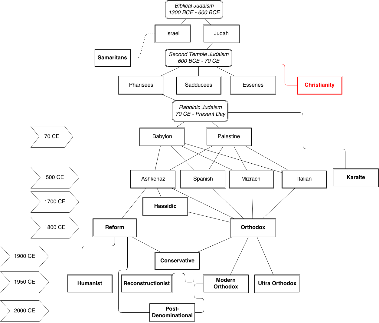
Here's a quick chart I made, based on my own knowledge.
It flows chronologically from top-to-bottom, and is not drawn to scale. (Horizontal axis is meaningless.) Bold boxes are groups that are still around today. Italic boxes are general categories. Dashed lines indicate unknown or disputed; Curved lines indicate indirect relationship. Dates are approximate, and the arrow-boxes with dates indicate the beginning of that period, as most of those eras extend through the present day. For 1900 CE - Present day: This chart is only applicable for Judaism in America, as it developed differently in Europe and Israel. This chart is a gross oversimplification and there are probably mistakes. If you think I got something wrong, please comment.
Without further ado:


